Fill Gradient Filter Component
Overview
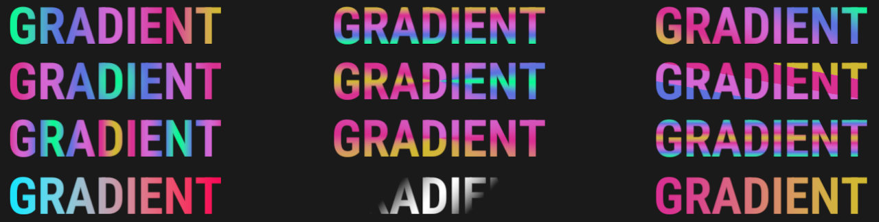
This component can fill a UI element with a gradient of colors, with many options available.
WebGL Demo
Properties
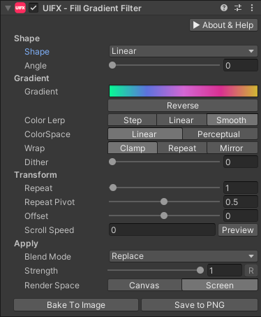
| Property | Type | Range | Default | Description |
|---|---|---|---|---|
| Shape | ||||
| Shape | Enum | Horizontal | The shape of the gradient Graphic to fill. Options are:• None: The whole graphic is filled with the same gradient value. This can still animate using Offset or Scroll Speed.• Horizontal: Gradient starts at the left edge and ends at the right edge.• Vertical: Gradient starts at the top edge and ends at the bottom edge.• Diagonal: Gradient starts at the top-left corner and ends at the bottom-right corner.• Linear: Gradient follows the W3C definition for a linear gradient going in the direction specified by an angle.• Radial: Gradient starts from a specified point and radiates outwards.• Conic: Gradient starts from a specific point and sweeps outward based on the angular direction to that point. | |
| Diagonal Flip | Bool | False | Flip the Diagonal gradient shape so the gradient starts at the bottom-left corner and ends at the top-right corner. | |
| Angle | Float | [0..360] | 0.0 | Angle for the gradient in Linear mode. Angle starts at 0 which is from bottom to top and continues clockwise. |
| Radius | Float | [0..16] | 0.5 | Radius of the gradient in Radial mode. |
| CenterX/Y | Float | [-2..2] | 0.0 | Position of the gradient origin in Radial and Conic modes. 0.0 correspond to the center, -1.0 and 1.0 correspond to the edges of the rectangle. -2.0 and 2.0 correspond to double the distance from the edges. |
| Gradient | ||||
| Gradient | Gradient | Default | The gradient to fill the Graphic with. | |
| ColorSpace | Enum | Linear | The color-space used to blend the graphic colors in. Options are: • Linear: Convert colors to sRGB/linear before blending depending on the active colorspace in Unity.• Perceptual: Convert colors to OKLAB before blending. This is the most expensive option but gives the most natural results. | |
| Lerp | Enum | Smooth | The interpolation type to use when sampling the gradient. Options are: • Step: No interpolation, just sample the nearest color stop.• Linear: Use linear interpolation.• Smooth: Use smoothstep interpolation. | |
| Wrap | Enum | Clamp | How to tile the gradient when it is repeated. Options are: • Clamp: No tiling/repeating - the first and last colors extend to infinity.• Repeat: The gradient repeats when tiling.• Mirror: The gradient trepeats when tiling, but alternates direction after each tiling. | |
| Dither | Float | [0..1] | 0.125 | Apply a random dithering when sampling the gradient which can help reduce banding, especially for dark gradients. |
| Transform | ||||
| Repeat | Float | [0..100] | 1.0 | Scale the gradient to create a zoom in or zoom out effect. |
| Repeat Pivot | Float | [0..1] | 0.5 | The position on the gradient to use for scaling. Usual values of 0.0, 0.5 and 1.0 correspond to the scaling happening from the start, center and end of the gradient respectively. |
| Offset | Float | [-1..1] | 0.0 | Offset the gradient position. |
| Scroll Speed | Float | [-inf..inf] | 0.0 | Set an animation speed to offset the gradient. |
| Apply | ||||
| Blend Mode | Enum | Alpha Blend | The blending mode to apply the gradient to the original Graphic. Options are:• Replace: Replace the destination colors with the fill color.• Alpha Blend: Blend the fill color over the destination colors.• Multiply: Multiply the fill color with the destination color.• Darken: Fill with the minimum color values between the destination and fill color.• Lighten: Fill with the maximum color values between the destination and fill color.• Replace (Alpha): Only replace the alpha channel.• Replace Background: Replace the background with the fill. | |
| Strength | Float | [0..1] | 1.0 | Strength of the effect. |
| Render Space | Enum | Canvas | Which coordinate system use when rendering this filter. Options are: • Canvas: Render the filter before any transforms (scale/rotation/translation etc) are applied.• Screen: Render the filter after transforms have been applied. Read more about this property here. |
Usage
Add this component to any GameObject that contains a UI Graphic component (eg Text, Image, RawImage, etc). The object will now render with a shadow.
Usage with TextMeshPro
To use this filter effect with TextMeshPro use the Filter Stack (TextMeshPro) component.
Render Space
The RenderSpace property effectively controls whether the Graphic filter is applied before or after the Transform is applied. There are two options:
Canvas- This is the default mode for all filters. In this mode the filter is rendered to theGraphicbefore it is transformed into screen-space by the localTransformand by theCanvas. This means that any changes or animations to the transform (or it's parents) will not cause the filter to re-render (unlessCanvashas per-pixel mode enabled), which is a performance benefit! This also means that when theGraphicis rotated, the filter will not be aware of this, so the filter will rotate as well. Imagine as drop-shadow effect.Screen- This was the default mode before version 1.8.0 was released. In this mode the filter is rendered to theGraphicafter it is transformed into screne-space. This means that any changes or animations to the transform (or it's parents) will cause the filter to re-render which can become expensive. It has the advantage that it is possible to do some screen-aware options, such as clamping the filter to the edges of the screen, or extending an edge to the edge of the screen (for example in the Frame Filter component)
A summary of the differences:
| Feature | Canvas | Screen |
|---|---|---|
| Adjusting transform causes filter re-render | No (unless Canvas has per-pixel mode enabled) | Yes |
Scripting
Namespace
The namespace
using ChocDino.UIFX;
Adding the Component
Add the component to your GameObject
// Add the component to your GameObject and set default properties
var fill = AddComponent<FillGradientFilter>();
fill.Shape = GradientShape.Horizontal;
fill.Gradient = ColorUtils.GetBuiltInGradient(BuiltInGradient.SoftRainbow);
fill.LerpMode = GradientLerp.Smooth;
fill.ColorSpace = GradientColorSpace.Linear;
fill.WrapMode = GradientWrap.Clamp;
fill.Dither = 0f;
fill.Repeat = 1f;
fill.RepeatCenter = 0.5f;
fill.Offset = 0f;
fill.ScrollSpeed = 0f;
fill.BlendMode = FillGradientBlendMode.AlphaBlend;
Set Linear Gradient Shape
Set linear gradient shape
// Set a linear gradient
var fill = GetComponent<FillGradientFilter>();
fill.Shape = GradientShape.Linear;
fill.LinearAngle = 45f;
Set Diagonal Gradient Shape
Set diagonal gradient shape
// Set a diagonal gradient
var fill = GetComponent<FillGradientFilter>();
fill.Shape = GradientShape.Diagonal;
fill.DiagonalFlip = false;
Set Radial Gradient Shape
Set radial gradient shape
// Set a radial gradient
var fill = GetComponent<FillGradientFilter>();
fill.Shape = GradientShape.Radial;
fill.CenterX = 0f;
fill.CenterY = 0f;
fill.Radius = 0.5f;
Set Conic Gradient Shape
Set conic gradient shape
// Set a conic gradient
var fill = GetComponent<FillGradientFilter>();
fill.Shape = GradientShape.Conic;
fill.CenterX = 0f;
fill.CenterY = 0f;
fill.Radius = 0.5f;
Set Gradient Colors
Set gradient colors
// Set custom gradient colors
var fill = GetComponent<FillGradientFilter>();
fill.Gradient = new Gradient()
{
  colorKeys = new GradientColorKey[]
  {
    new GradientColorKey(Color.red, 0f),
    new GradientColorKey(Color.white, 1f)
  }
};
Set Gradient Colors + Alpha
Set gradient colors + alpha
// Set custom gradient colors and alpha
var fill = GetComponent<FillGradientFilter>();
fill.Gradient = new Gradient()
{
  colorKeys = new GradientColorKey[]
  {
    new GradientColorKey(Color.red, 0f),
    new GradientColorKey(Color.white, 1f)
  },
  alphaKeys = new GradientAlphaKey[]
  {
    new GradientAlphaKey(1f, 0f),
    new GradientAlphaKey(0f, 1f),
  }
};
Modify Gradient Colors
Modify gradient colors
// Modify existing gradient colors (NOTE: Unity Gradients require making a copy of the keys)
var fill = GetComponent<FillGradientFilter>();
Gradient gradient = new Gradient();
var colorKeys = fill.Gradient.colorKeys;
var alphaKeys = fill.Gradient.alphaKeys;
colorKeys[0].color = new Color(Random.value, Random.value, Random.value, 1f);
fill.Gradient.SetKeys(colorKeys, alphaKeys);
fill.ForceUpdate();